Yolk & Folk
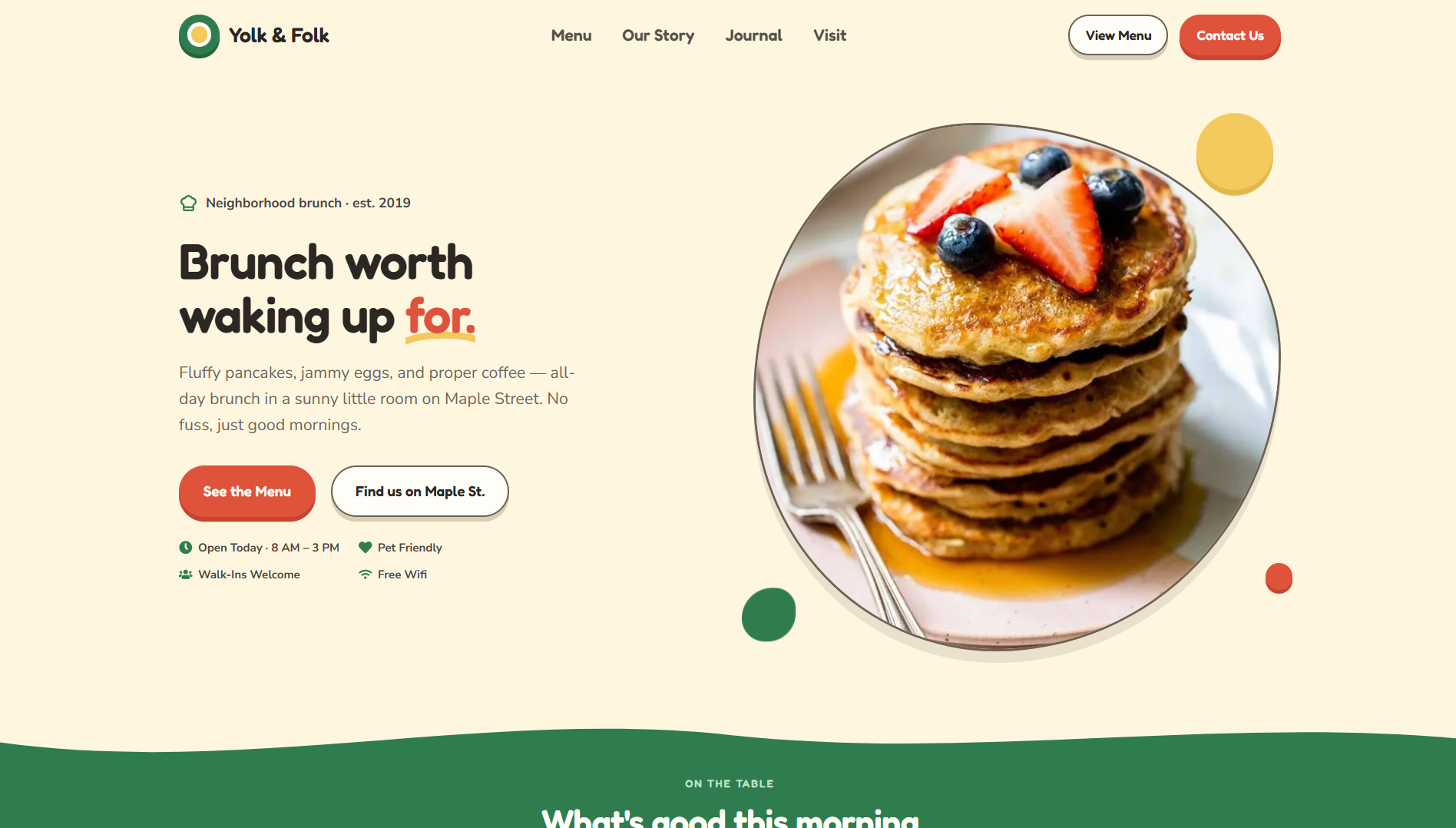
A cartoonish landing site for Yolk & Folk, a fictional neighborhood all-day brunch cafe. Thick borders, hard offset shadows, and wave dividers on top of a fully CMS-driven section system — menu, story, reviews, journal, and visit info all editable from the studio.
 Next JS
 Sanity
 Typescript
 Tailwind CSS
 Framer Motion
What I Built
Yolk & Folk is a fictional neighborhood brunch cafe — Maple Street, est. 2019, walk-ins only, "brunch worth waking up for." I designed and built the whole site as a portfolio project: home, about, contact, a full menu page, and a journal with real posts, authors, and categories.
The cafe isn't real. Nobody's walking in for pancakes. It's a sandbox I built to answer one question: can a loud, cartoonish brand identity survive inside a system that's actually built to be reused and updated, without the personality getting sanded down or the structure getting buried?
Why I Built It
My last two example sites — Atrium Studio and Ridgeline Roofing — both lived in restrained, professional territory: clean type, sober palettes, trust doing the heavy lifting. I wanted the opposite test. A brand where the visual character is the product. Food and hospitality is the honest place to try that — a cafe site sells a feeling before it sells a dish, and getting that feeling wrong is a lot more visible than a corporate layout being slightly off.
Most local cafe sites are either a single-page template with a PDF menu bolted on, or a beautiful one-off the owner can never touch again without calling a developer. I wanted to see if a strongly styled identity — thick borders, hard offset shadows, rotated cards, wave dividers, floating blobs — could be broken down into pieces that hold up under reuse instead of just looking good once.
How I Did It
I designed the whole thing as mockups first — landing, menu, about, contact, journal, journal post, nav, footer — before writing any code. That forced the identity to settle early: forest green, cream, tomato red, yolk yellow; Fredoka for headings, Nunito Sans for body; 3px borders and hard shadows with no blur, so everything reads hand-cut instead of glossy.
From there I broke every screen down into reusable section variants — sixteen new ones across hero, feature, showcase, testimonial, gallery, contact, steps, team, CTA, FAQ, nav, footer, and text sections. Two things I had to build from scratch: a proper menu section (categories, dish rows, prices, dietary tags, an allergy footnote) and a section that pulls in the latest journal posts automatically instead of making someone hand-pick them every week.
What Makes It Different
The cartoon styling is heavy on purpose, but hours, address, phone, and the menu are never more than a tap away — the test for every rotated card and floating blob was whether it still let someone find breakfast. And none of it is a one-off: the palette, shadows, and fonts are swappable, so the same sections could carry a completely different brand tomorrow.
What I Gained
A third example site that pushes into playful, personality-led branding instead of another restrained business layout. Real practice turning finished visual design into reusable pieces rather than rebuilding every page by hand. Two new section types I'll keep using. And a clearer sense of where a theme's tokens end and the actual design work begins.
Key Takeaway
A strong style is only worth building if someone other than me can maintain it. Yolk & Folk pushed the visual language as far as I could take it while keeping every dish, price, hour, and post easy to update — and that constraint made the design better, not smaller.